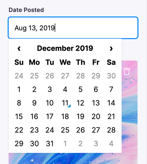
Date & Time Field
This is an advanced-use feature, and likely not something you'll need to configure. What you probably want is the content types reference
The date field represents a date and time picker. It can be used for data values that are valid date strings.

Options
This field plugin uses react-datetime under the hood.
interface DateConfig extends FieldConfig, DatetimepickerProps {
  component: 'date'
  name: string
  label?: string
  description?: string
  dateFormat?: boolean | string // Extra properties from react-datetime
  timeFormat?: boolean | string // Moment date format
}| Option | Description |
|---|---|
component | The name of the plugin component. Always 'date'. |
name | The path to some value in the data being edited. |
label | A human readable label for the field. Defaults to the name. (Optional) |
description | Description that expands on the purpose of the field or prompts a specific action. (Optional) |
dateFormat | Defines the format for the date. It accepts any Moment.js date format (not in localized format). If true the date will be displayed using the defaults for the current locale. See react-datetime docs for more details. (Optional) |
timeFormat | Defines the format for the time. It accepts any Moment.js time format (not in localized format). If true the time will be displayed using the defaults for the current locale. If false the timepicker is disabled and the component can be used as datepicker. See react-datetime docs for more details.(Optional) |
FieldConfig
This interfaces only shows the keys unique to the date field.
Visit the Field Config docs for a complete list of options.
DatetimepickerProps
Any extra properties added to the the date field definition will be passed along to the react-datettime component. Moment.js format is used. See the full list of options here.
Example: Add "Created At" to Form
const formConfig = {
  fields: [
    {
      name: 'created_at',
      label: 'Created At',
      component: 'date',
      dateFormat: 'MMMM DD YYYY',
      timeFormat: false,
    },
  ],
}