Color Field
Table of Contents
This is an advanced-use feature, and likely not something you'll need to configure. What you probably want is the content types reference
The color field is a visual color picker. This field is used for content values that handle the rendering of color. Can be saved as RGB or hex value.
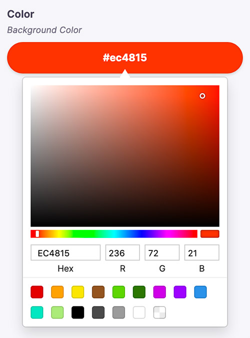
There are two types of color widgets, "sketch" or "block". The "sketch" widget allows the editor to pick a color from the familiar picker seen below.

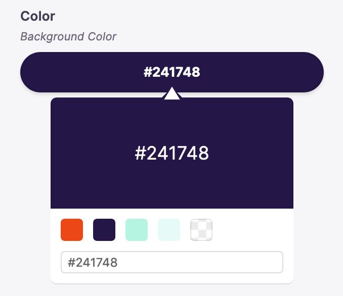
The "block" widget allows the editor to choose from a set of predefined color swatches.

Options
interface ColorConfig {
  component: 'color'
  name: string
  label?: string
  description?: string
  colorFormat?: 'hex' | 'rgb' // Defaults to "hex"
  colors?: string[]
  widget?: 'sketch' | 'block' // Defaults to "sketch"
}| Option | Description |
|---|---|
component | The name of the plugin component. Always 'color'. |
name | The path to some value in the data being edited. |
label | A human readable label for the field. Defaults to the name. (Optional) |
description | Description that expands on the purpose of the field or prompts a specific action. (Optional) |
colorFormat | Specify whether you want the color value to be a hexadecimal ('hex') or RBG value. (Optional) |
colors | An array of 'swatch' values that will either display as options below the "sketch" widget, or will serve as swatch options for the "block" widget. If no colors are passed, a set of default colors will render, ROYGBIV style. (Optional) |
widget | An optional string indicating whether the "sketch" or "block" widget should render. This will default to "sketch" if no value is passed. (Optional) |
This interfaces only shows the keys unique to the color field.
Visit the Field Config docs for a complete list of options.
Definition
const BlogPostForm = {
  fields: [
    {
      name: 'rawFrontmatter.background_color',
      component: 'color',
      label: 'Background Color',
      description: 'Edit the page background color here',
      colorFormat: 'hex',
      colors: ['#EC4815', '#241748', '#B4F4E0', '#E6FAF8'],
      widget: 'sketch',
    },
    // ...
  ],
}