Creating a custom field component
A field plugin's Component is a React component that accepts three props:
field: The field definition for the current field.input: The data and callbacks necessary to make an input.meta: Metadata about the field in the form. (e.g.dirty,valid)
Checkout the react-final-form docs for a more detailed description of the input and meta props.
Creating a Custom Component For Our New Field Plugin
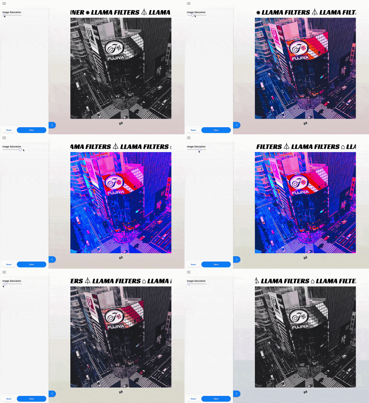
Let's create a basic slider component:
export default function RangeInput({ field, input, meta }) {
  return (
    <>
      <div>
        <label htmlFor="saturation">Image Saturation</label>
      </div>
      <div>
        <input
          name="saturation"
          id="saturation"
          type="range"
          min="0"
          max="10"
          step=".1"
          {...input} // This will pass along props.input.onChange to set our form values as this input changes.
        />
      </div>
    </>
  )
}
Now that we have a custom field component, we can:
Once that's wired up, our editors will be able to use our new range field in their site.

Using Tina Styles
If you want to style the custom field to fit in with the rest of the Tina sidebar, you'll need to use the CSS custom properties defined in @tinacms/styles.
Example
import styled from 'styled-components'

// Use the Tina CSS variables in your styled component
const Label = styled.h3`
  color: var(--tina-color-primary);
  font-size: var(--tina-font-size-3);
  font-weight: var(--tina-font-weight-bold);
  border-radius: var(--tina-radius-big);
  border: 1px solid var(--tina-color-primary-light);
  transition: color linear ease var(--tina-timing-medium);
  padding: var(--tina-padding-small);
`
Now you should have a working slider component! The next steps would be to create a field plugin that uses this component, and update a field in your schema to use this new field plugin.